Tableau for Beginners - Area Charts and Choropleth Maps
- Sam Hamill

- Nov 13, 2020
- 3 min read
Updated: Nov 14, 2020
Data Used:

Goal: How are the company's customer sales changing over time in relation to each other?
PART A: AREA CHART
1. Our Data
By looking at the data, we can see that the "segment" field could also be named "customer user type". Whether you decide to change the field name or not, knowing what the field represents will help you in further distinguishing the setting the products will be used for.
2. Area Chart Format
In order to create an area chart, we need to have 1 measure and 1 dimension pill. Knowing this, what kind of visualization could we come up with, which would be useful for the company to make decisions? If we were to give a summary of company performance over time, it would be useful to use profit and order date. Because profit can change so drastically from day-to-day and month-to-month, looking at year could show a more stable pattern of either increase or decrease:

3. Additional Insights
Now that we can see the company's sales have an upward trend, we can further subdivide the visualization based on the other fields of data. Let's say we wanted to check the performance of the categories of products over time:

This particular visualization shows the level of profit of each product category (technology being the least profitable). Knowing this, we could dive deeper into technology to see how the individual products perform. If we bring the subcategory pill to the colors and bring the category pill to the filters(check tech only), we'll be able to see this:

Notice anything unique about this chart? Machines seem to have numerous periods of loss of profit, never good for a company and an important insight for decision-makers to know. CONCLUSION: While a dual-line chart might be best for visualizing this particular insight, we were able to discover an important aspect of a business that could help strengthen the profit over time.
PART B: CHOROPLETH MAP
Data Used:
1. Looking at Data
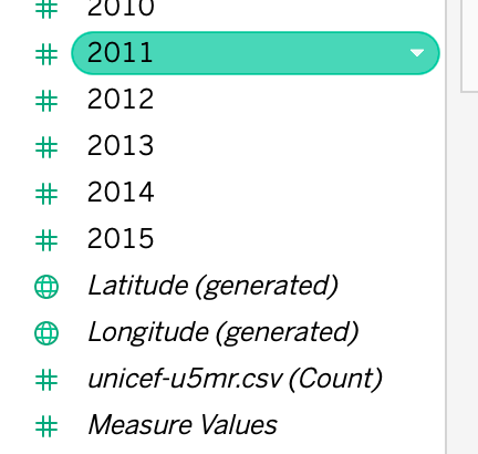
From looking at the data, we can see that we have a "country" field, as well as mortality rates for each country from 1950-2015. We also have some Tableau automatically generated fields geological dimensions, which include "Longitude" and "Latitude" coordinates:
2. Choropleth Map Formatting
There are two different ways in which we can create a choropleth map. The first is simply dragging the longitude and latitude pills to the row and column. The second can be by clicking on the "show me" tab and using the listed requirements of data:

3. Making Information Easily Seen
Now that we have the formatting done, we can add additional data to make the map easily understood by an audience. By dragging the "Country" pill to the "details" mark, this ensures a country name is revealed when hover over the map. Additionally, if we were to drag the "country" pill to the colors, much like the other assignments, this will create a legend as a color-scale. By making the color scale 2 distinct colors, we will be highlighting high value areas, making it easy for an audience to visually understand:

4. Insights
Because the data available is so limited, there is not much we can do outside of creating additional fields to create additional insights. By looking at this map we can see Africa is suffering the most from infant mortality rates. If, for instance, we had additional data like healthcare funding, we could create additional insights as to how a country's healthcare funding and mortality rates are correlated.


Comments