Tableau for Beginners - Calculated Fields
- Sam Hamill

- Nov 23, 2020
- 2 min read
Dataset Used:

1. What is the Most Common First Letter for Male Characters with Yellow Eyes?
By looking at the data, we can see that there is not a "first letter" field. In the case of looking for insights that may not be readily available, calculated fields may fill the gap. In this case, because we have a "name field", we can simply created a field that extracts the first letter:
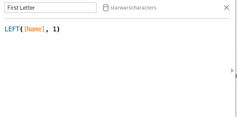
Now that we have the field created, we can use it to visualize what we want. While there may be many ways to visualize this information, using a simple bar chart would be easily understood on first glance:

CONCLUSION: "D" is the most common first letter in males with yellow eyes.
PART II
Data Set Used:

1. Assuming Tax Due to Government is 7.25%, which product category has the highest sales tax due in 2017?
From looking at the above question, what do you think needs to be done in order to visualize this information? From looking at the data set, we can see that we have a gross sales field but no tax due. Gross sales are sales before any deductions, taxes, etc. so let's create a calculated field based off that knowledge and the 7.25% due:

Now that we have this calculated field, we can visualize the data. Remember, because we are only looking at 2017, we want to create a filter to only show that information:

CONCLUSION: Footwear Products had the highest sales tax due in 2017.
PART III (Creating Consistent Formatting)
Dataset Used:
1. Creating "Full Name" Field
From looking at the data, we can see that we have "first name","last name", and "middle name" fields. In order to combine all these into one field we need to utilize the calculated field:

By using the "ISNULL" function, we are eliminating information that is not useful (empty cells). Now that we have consolidated this information into one field, we can start visualizing.
2. Meeting Duration
From looking at the data, we can also see that we have the "meeting start time" and "meeting end time", but no length of meeting. Because this would be a valuable field, we need to create another calculated field to create that information:

3. Visualize Data
Now that we have created 2 valuable fields of data, we can visualize them. For instance, if we wanted to see who visited the most and how long they spent in the meeting we could utilize our newly created fields:

By dragging the "meeting duration" pill to the label, we will be making two important pieces of information viewable by our audience (how many times they visited and the total length). In addition to this useful insight, we could visualize when these visits happened in order to establish if a pattern occurred:

CONCLUSION: Wednesday was the busiest time of the week for meetings, while Mr. Cannon had the most number of visits and time.


Comments